Logistics · Fleet Management
Fleet owners managing drivers, vehicles, and earnings had one tool: WhatsApp. This dashboard replaced the group chat with a single screen that actually knows what's happening.
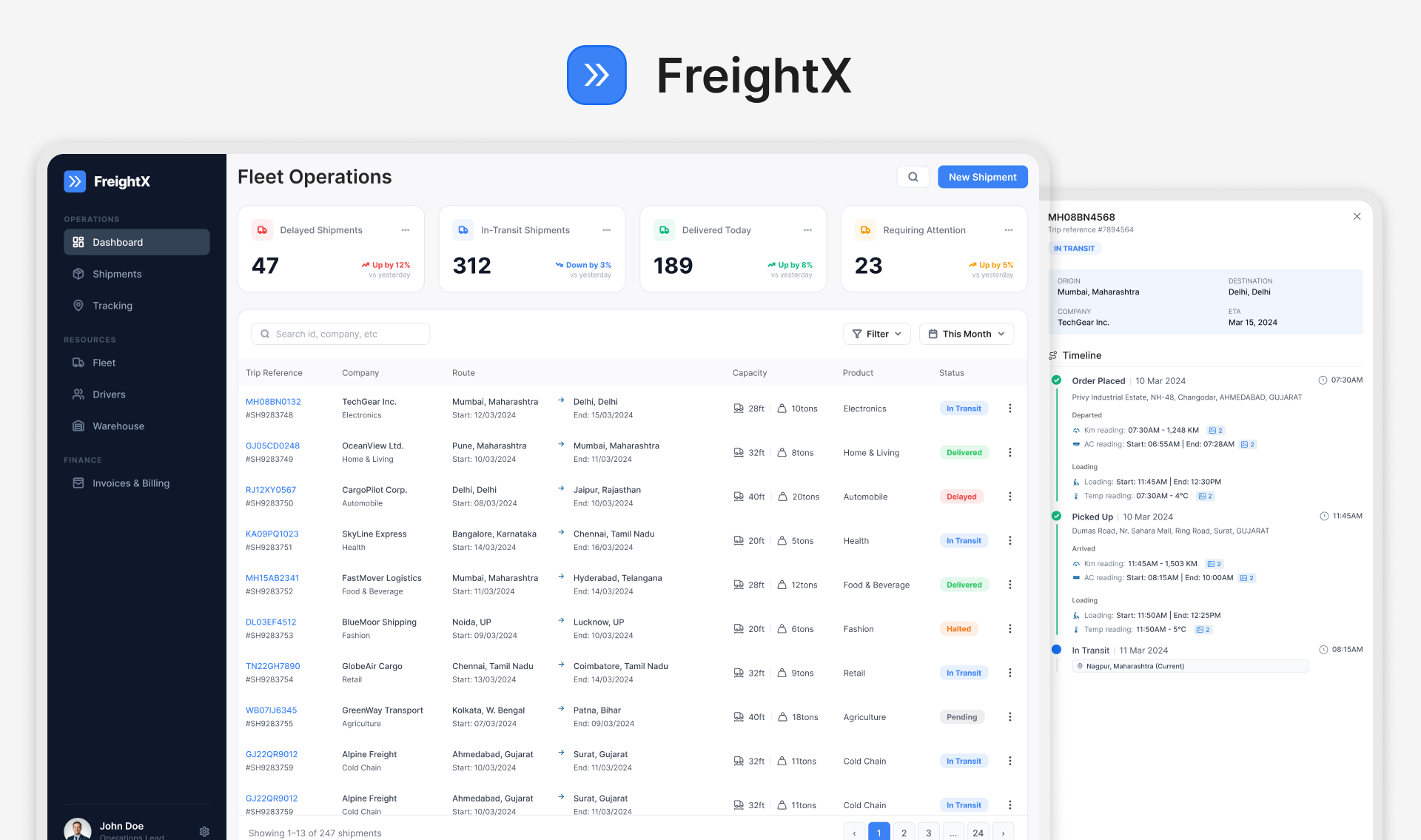
— The Problem
A fleet owner managing 40 trucks has one job: keep the vehicles moving and the drivers earning. But the tools available forced them to manage everything reactively. A truck breaks down. The driver calls. The owner calls the mechanic. The next trip slips. Nobody saw it coming.
The entire operation ran on memory, phone calls, and a WhatsApp group that mixed earnings updates with lunch orders. (That last part is not an exaggeration. I read the chats.)
There was no single place where the owner could see, decide, and act. That was the only gap that mattered.
Everything else was a symptom of that one missing thing.
— The Thesis
Most fleet tools show data. They show how many trips completed, how many hours logged, how much earned. All of it is past tense. All of it is useless when a truck is idle right now and the owner doesn't know.
I wasn't building a reporting tool. I was building a control room. Every widget had to answer the same question: what do I need to do next? Not what happened yesterday.
— The Model
The dashboard is not a list of pages. It's a single screen with three zones, each covering a different type of decision the fleet owner makes every day.
Every truck shown as a live tile: on trip, idle, or offline. Idle trucks are highlighted in red, with a one-tap assign flow directly from the status tile. The owner doesn't navigate anywhere. The action is right there.
In plain terms: see what's moving and what isn't, right now.
Trip count, earnings, and on-time rate per driver, updated live. Not a leaderboard for competition. A signal for the owner: which driver needs a break, which one is underutilised, which one has earned a bonus conversation.
In plain terms: know your people, not just your trucks.
Maintenance due dates, flagged issues, and service history per vehicle. Alerts surface automatically before they become breakdowns. A truck that needs a service shows up in amber. A truck that's overdue shows up in red. Neither waits for the driver to notice.
In plain terms: the dashboard finds the problem before the road does.
— The Guardrail
An owner who sees 14 notifications every morning will stop reading them by Tuesday. The only alerts that belong on screen are the ones that require action today.
Show everything. Let the owner filter. Build a notification centre with categories and read/unread states. This is how most fleet tools are built, and why most fleet owners still use WhatsApp.
Alerts are ranked by urgency and time sensitivity before they surface. A tyre pressure flag on a truck doing a trip tomorrow shows up today. A general service reminder due in three weeks does not. The screen stays readable because the system does the triage.
— Designed Against
The fleet owner this dashboard was built for is not a tech-first person. He runs a business that has worked the same way for 15 years. He doesn't want a new way to do things. He wants the things he already does to stop being exhausting.
An early direction had filters, tabs, date range pickers, and a sidebar. It took 6 taps to see today's earnings across all drivers.
Discarded.
The dashboard had to show the most important thing without being asked. If the owner opens the app and the answer isn't on screen in three seconds, the app has already failed.
— The Outcome
Fleet owners can see every truck's live status, every driver's earnings, and every vehicle alert without opening a single other app. Idle trucks surface with a direct assign action. Maintenance issues flag before trips are affected.
The design decision that mattered most was not a feature. It was the decision to show only what requires action today, and trust the system to figure out what that is so the owner doesn't have to.
A fleet owner running 40 trucks can now manage the whole operation from one screen in under 30 seconds. That's the bar this dashboard was built for.